How How to Change the Colors in a Sunburst Graph?
Sunburst Graphs
I was recently looking for a neat way to display nested ratios. What do I mean by nested ratio? Well, imagine a taxonomy where you have different hierarchical levels and you want to show the ratios of all levels simultaneously.
There are a couple of different ways of how to show these, like mosaic plots, tree plots or sunburst charts. Despite being a close relative to the most despised pie chart (of which Tufte himself said that the only worse design than a pie chart is several of them1) they can be useful - if you use them with care-2
Anyways, this should bot be blog post about the usefulness of pie charts and their relatives but the rtaher technical question of
- How to ploit them?
- How to change the color of the wedges?
So let’s start with some code. I use the Titanic data set here, because it comes
already with a nice hierarchical structure.
library(dplyr)
library(forcats)
titanic <- as_tibble(Titanic) %>%
   mutate(across(where(is.character), fct_inorder))
str(titanic)
## tibble [32 x 5] (S3: tbl_df/tbl/data.frame)
## $ Class : Factor w/ 4 levels "1st","2nd","3rd",..: 1 2 3 4 1 2 3 4 1 2 ...
## $ Sex : Factor w/ 2 levels "Male","Female": 1 1 1 1 2 2 2 2 1 1 ...
## $ Age : Factor w/ 2 levels "Child","Adult": 1 1 1 1 1 1 1 1 2 2 ...
## $ Survived: Factor w/ 2 levels "No","Yes": 1 1 1 1 1 1 1 1 1 1 ...
## $ n : num [1:32] 0 0 35 0 0 0 17 0 118 154 ...You can see that we have 4 x 2 x 2 x 2 rows corresponding to all possible combinations of Class, Sex, Age and Survived.
The classical display (?Titanic) is the mosaic plot:
mosaicplot(Titanic)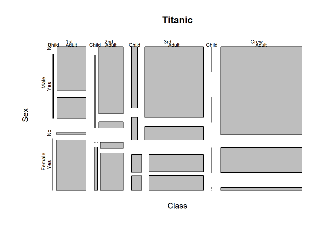
Maybe it is me, but I find it difficult to read the graph properly. Furthermore, as the chart is static, we get only static information. Thus, if we want to get the underlying numebrs we need to provide yet another table.
Plotly
Enters plotly. With plotly we can make our graphs more
interactive and most notably we can create a sunburst chart. However, we need some
data aggregation first as the sunburt chart expects the data in a special format
(c.f. the docs). W.l.o.g. we define the
hierarchy as Class > Age > Sex > Survived. We have now to construct the hierarchy
using aggregation at different levels.
library(plotly)## Loading required package: ggplot2##
## Attaching package: 'plotly'## The following object is masked from 'package:ggplot2':
##
## last_plot## The following object is masked from 'package:stats':
##
## filter## The following object is masked from 'package:graphics':
##
## layoutlibrary(glue)
bg_trans <- . %>% layout(paper_bgcolor = "#00000000")
lvl4 <- titanic %>%
transmute(id = glue("{Class}-{Age}-{Sex}-{Survived}"),
parent = glue("{Class}-{Age}-{Sex}"),
value = n,
label = Survived)
lvl3 <- titanic %>%
group_by(Class, Age, Sex) %>%
summarise(value = sum(n), .groups = "drop") %>%
transmute(id = glue("{Class}-{Age}-{Sex}"),
parent = glue("{Class}-{Age}"),
value,
label = Sex)
lvl2 <- titanic %>%
group_by(Class, Age) %>%
summarise(value = sum(n), .groups = "drop") %>%
transmute(id = glue("{Class}-{Age}"),
parent = glue("{Class}"),
value,
label = Age)
lvl1 <- titanic %>%
group_by(Class) %>%
summarise(value = sum(n), .groups = "drop") %>%
transmute(id = glue("{Class}"),
parent = "Total",
value,
label = Class)
lvl0 <- titanic %>%
summarise(value = sum(n)) %>%
transmute(id = "Total",
parent = "",
value,
label = "Total")
sunburst_data <- bind_rows(
lvl0,
lvl1,
lvl2,
lvl3,
lvl4
)
(sb <- sunburst_data %>%
plot_ly() %>%
add_trace(ids = ~id,
labels = ~ label,
parents = ~ parent,
values = ~ value,
type = "sunburst",
marker = list(line = list(color = "#FFF")),
branchvalues = "total") %>%
bg_trans())Again, it may be personal preferences, but this chart seems to me much easier to understand:
- We see that roughly 40% of all persons on the Titanic were crew members, 25% of the passengers came 1st or 2nd class and a third from the 3rd class.
- There were no children in the crew (ok, a no-brainer) and only a few women.
- Females were more likely to survive than men.
- Passengers from the better classes had higher survival rates.
- Only children from the 3rd class died.
One nice property of the graph is that you can interactively zoom in and zoom out, which makes it very easy to read.
Colors
Plotly has a nice default choice of colors, but you may want to change them. While it seems to be straightforward for other plotly graphs it was not that clear to me how to change the color for the sunburst graph.
After a lot of googeling and more time on the excellent reference guide for plotly one path is to overwrite the default color palette via colorway:
library(viridis)## Loading required package: viridisLitecol_pal <- viridis(4)
sb %>%
layout(colorway = col_pal) %>%
bg_trans()But what if we want to get even fainer control over individual segments say? Well, we can specify a color for each segment individually, like this:
sunburst_data <- sunburst_data %>%
   mutate(color = case_when(label == "Yes" ~ col_pal[1],
                            label == "No" ~ col_pal[3],
                            label == "Child" ~ "#C994C7",
                            label == "Adult" ~ "#DD1C77",
                            label == "Male" ~ "#377EB8",
                            label == "Female" ~ "#E41A1C",
                            label == "Crew" ~ "#FFFFCC",
                            label == "1st" ~ "#78C679",
                            label == "2nd" ~ "#C2E699",
                            label == "3rd" ~ "#238443",
                            TRUE ~ "#DFDFDF"))

sunburst_data %>%
   plot_ly() %>%
   add_trace(ids = ~id,
             labels = ~ label,
             parents = ~ parent,
             values = ~ value,
             marker = list(colors = ~ color),
             type = "sunburst",
             marker = list(line = list(color = "#FFF")),
             branchvalues = "total") %>%
      bg_trans()
In this setting, the same categories get the same color. Admittedly, nobody with a clear mind would use such a colorful graph (not even those of us who grew up in the 80’s like myself 😉), but you get my point.
Maybe a more realistic use case would be to highlight certain parts of the graph to guide the reader’s attention. For instance we could try to highlight the children on board of the titanic.
sunburst_data <- sunburst_data %>%
   mutate(color = case_when(grepl("Child", id) ~ col_pal[1],
                            TRUE ~ "#DFDFDF"))

sunburst_data %>%
   plot_ly() %>%
   add_trace(ids = ~id,
             labels = ~ label,
             parents = ~ parent,
             values = ~ value,
             marker = list(colors = ~ color),
             type = "sunburst",
             marker = list(line = list(color = "#FFF")),
             branchvalues = "total") %>%
      bg_trans()
P.S. One final remark: most probably you have observed that the sunburst graph uses some sort of color intensity mapping, which results in reduced tints in the outer rings. I have not yet found the setting which controls this behavior. If you know how to change this setting, I will appreciate a quick comment.
The Visual Display of Quantitative Information, Edward Tufte, Graphics Press, 2001↩︎
The same holds true for pie chart, if you use them with 2 categories they can be informative, just because we are used to watches. However, I side with Tufte here that a table or the bare number may be more informative in these cases.↩︎